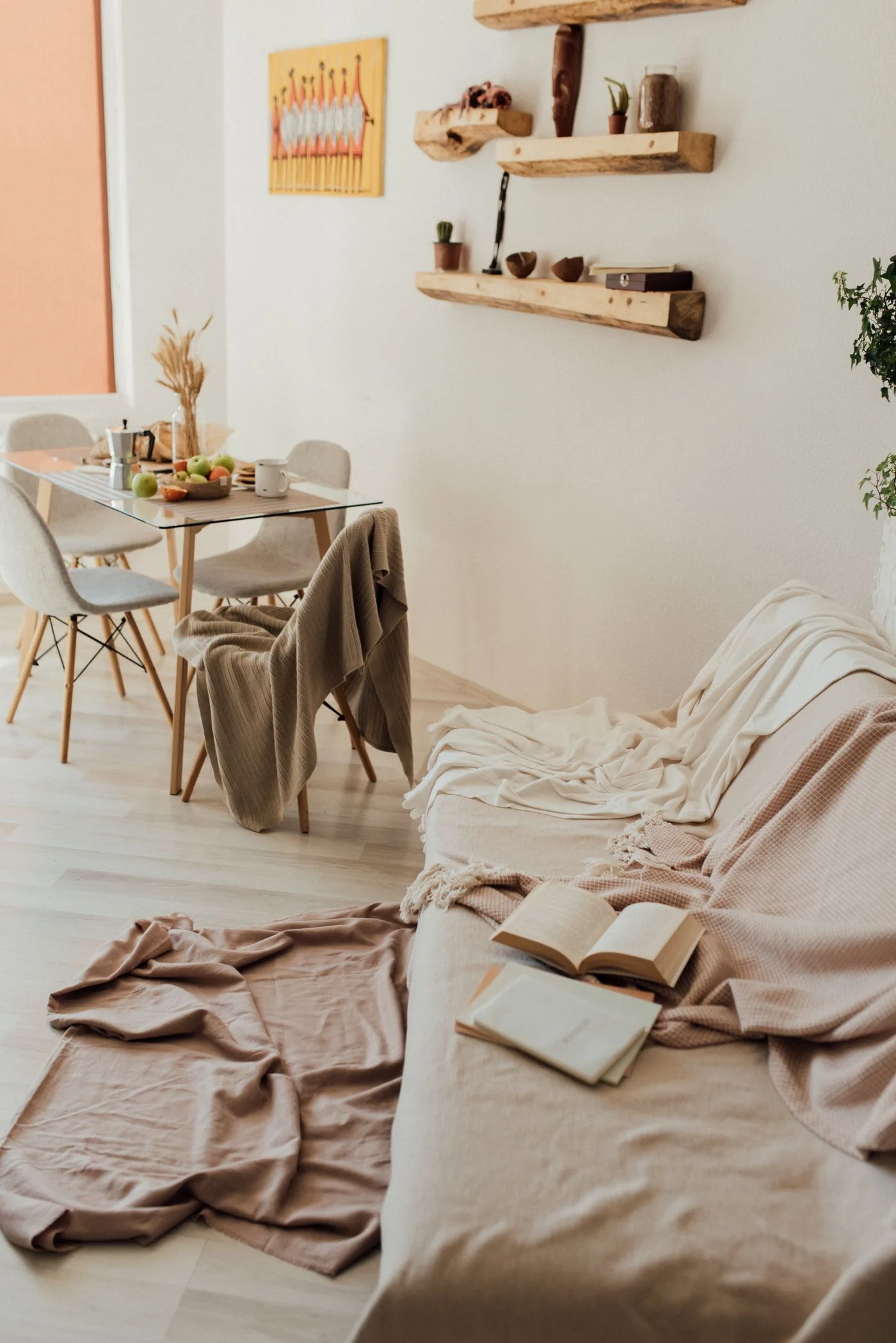
A wall colour is easier to judge in the actual room than on a small shop card. Light, flooring and the furniture kept in place all affect the impression. Before buying the full quantity, use suitable samples and view them at the times the room is occupied. The aim is a clear decision in context, not a search for a shade that looks identical under every possible condition.
Identify the fixed references
Note the flooring, large seating and other surfaces that will remain. A paint choice should be compared beside those real materials rather than an imagined future room. Clear a small viewing area if needed, but do not remove every existing reference and then judge the colour in isolation. If a fabric sample is used, check it against the actual object where possible rather than relying solely on a screen image.
Follow sample-product instructions
Use an appropriate prepared board or sampling method according to the supplier's guidance. Protect surfaces, read application and safety information and keep materials away from children and pets as directed. A sample needs to represent the intended finish sufficiently to answer the colour question. Do not assume a tiny unprepared patch or printed card predicts the complete result perfectly.
Move the sample around the room
View it beside the sofa, near the window and on the wall considered for the colour. Compare only a small shortlist at once so the decision remains manageable. A movable board can show different relationships without creating many unrelated patches. Keep the position and light in mind when recording an impression, because the same sample can look different across the room.
Check the times that matter
Look in morning light, later daylight and the normal evening lighting where relevant. You do not need to inspect continuously, but a single bright afternoon is not the whole room's life. If the colour looks different at night, assess the actual lamps and how the room is used then. A photograph can support notes, while camera exposure and screens mean it should not be the only evidence.
If every sample seems wrong
Return to the fixed references and desired effect. Are you seeking a lighter room, a warmer impression or a quieter backdrop? Clarify that goal rather than adding more near-identical swatches. Try a visibly different lightness or undertone within a manageable shortlist. A paint purchase should not expand into replacing useful furniture merely to justify a colour chosen without context.
Is a larger sample worth the effort?
It often offers more context than a tiny card, provided it is made and viewed appropriately. The useful size is one that lets you understand the relationship to existing materials. Once chosen, follow the manufacturer's preparation, ventilation, application and drying guidance, using suitable help where needed. Keep the exact product and finish details for future maintenance. A considered wall colour begins with the room that exists, not only the image that inspired it.
Related reading
Continue with How to Buy Autumn Knitwear You Will Want to Care For and A Carry-On Outfit Capsule for a Short Trip With Mixed Plans. These existing guides provide a broader starting point for the related wardrobe, home or planning decision.